BRANDING FOR A WATER TAPPING COMPANY
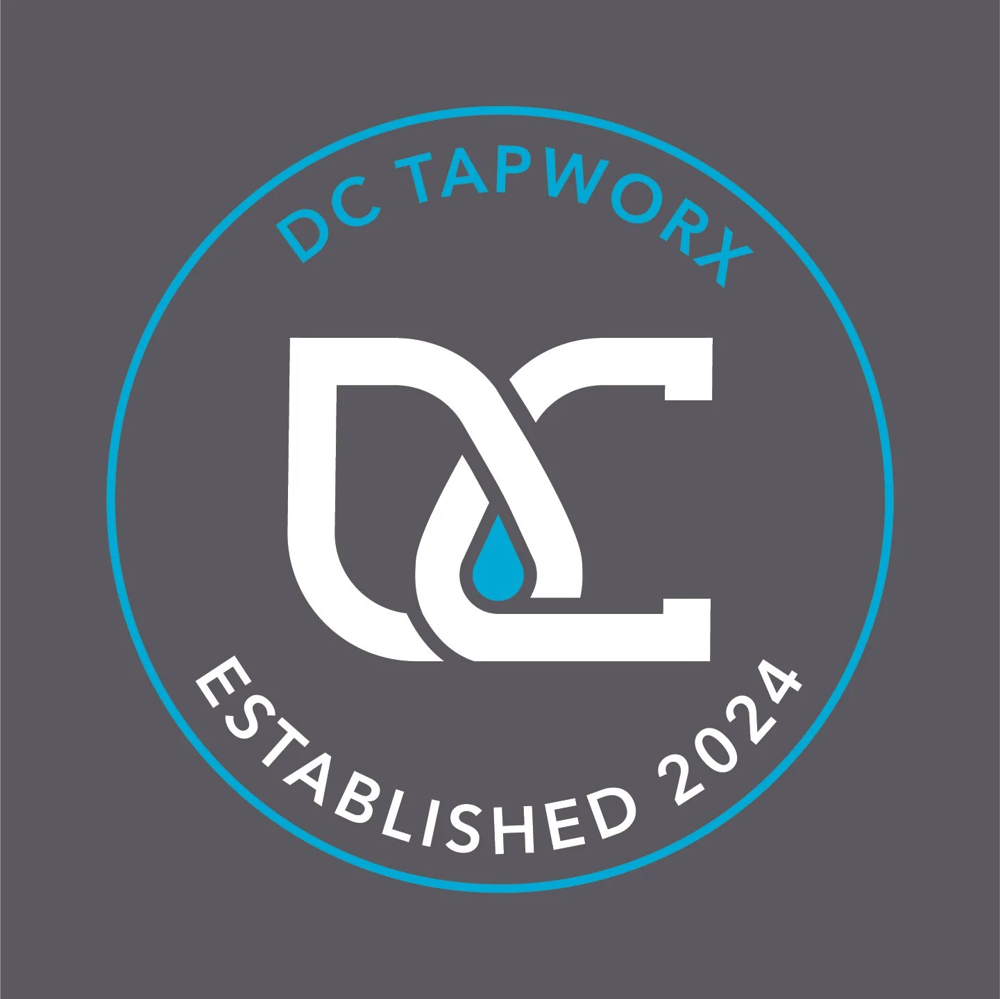
Introducing a distinctive logo for a company specializing in water pipe tapping. At its core, the design features the initials 'DC', representing the owner's identity. Cleverly crafted, the logo utilizes the negative space between the letters to form a water drop, symbolizing the essential service provided. The color palette of blue and gray reflects both the nature of water and the professionalism of the company, creating a visual identity that is both clean and memorable. This logo not only conveys the company's focus on water pipe tapping but also establishes a connection to reliability and trust.
Logo Variations
Alternate Logo

Business Card Design

Pickup Truck Mockup