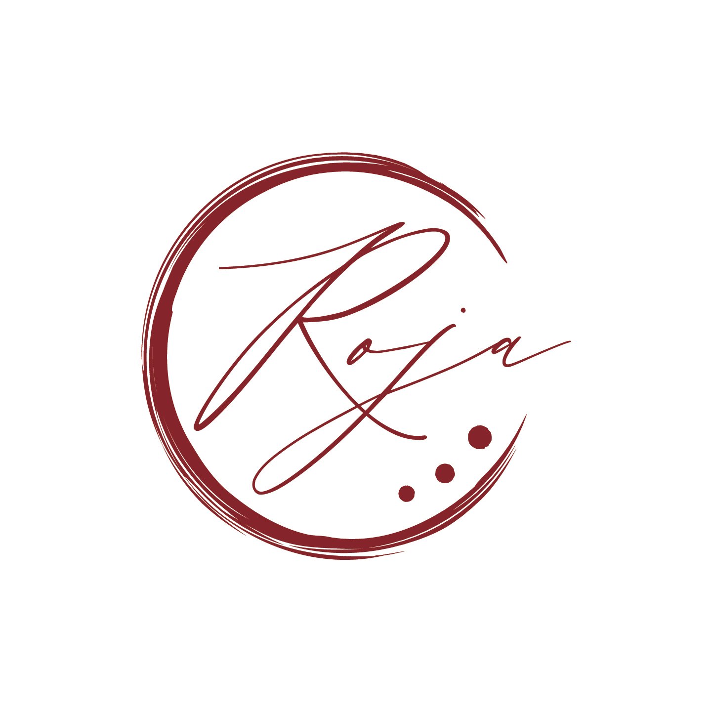
BRANDING FOR A FINE DINING RESTAURANT
Introducing the logo design for 'Roja', a fine dining restaurant celebrated for its exquisite sauces. Inspired by the names of the two owners, the logo seamlessly combines the initials RO and JA, creating a unique and sophisticated brand identity. Drawing further inspiration from the art of plate decoration, the design features elegant swirls and patterns that evoke the culinary creativity at the heart of Roja. The bold red color not only highlights the restaurant’s name but also symbolizes passion, warmth, and the rich flavors that define the dining experience. This logo serves as a visual representation of the artistry and excellence found within every dish at Roja.