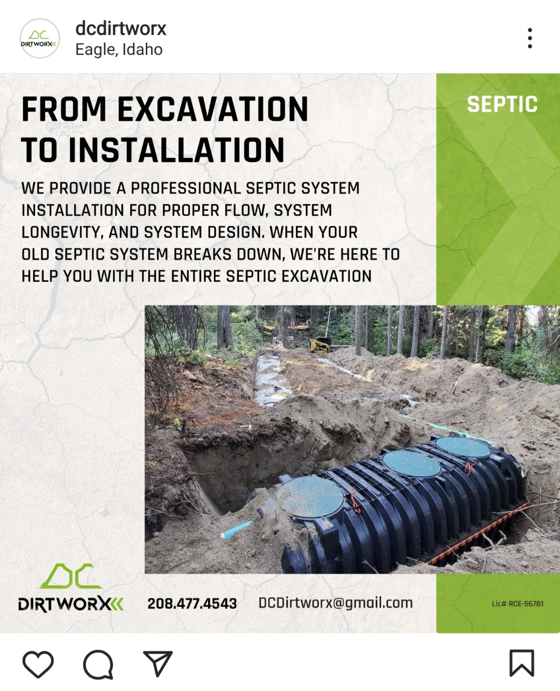
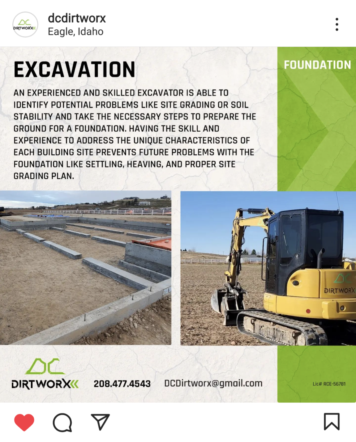
BRANDING FOR AN EXCAVATION COMPANY
They move the dirt so you don’t have to. It’s no secret that Excavation is a dirty job so I conveyed that in the logo. The DC initials are shapes taken after the outline of a tractor bucket. The logotype is strong and bold and is bookended with chevron shapes that are inspired by tractor tread. The challenge with this brand was to create a strong, grungy, mark without showing a tractor or excavator like you see with many of these companies. My solution to this was to use the bucket piece of the excavator to create the DC initials.


