BRANDING FOR A CONSTRUCTION COMPANY
Introducing the logo for Supreme Construction, where innovation meets tradition. This eye-catching design features a stylized house that symbolizes the company's commitment to building homes with care and precision. At the center, the 'SC' is cleverly crafted using negative space formed by hammers and nails, representing the tools of the trade and highlighting the craftsmanship that defines Supreme Construction. The deep red color not only conveys strength and reliability but also reflects the passion and dedication the company brings to every project. This logo embodies the essence of a construction company that strives for excellence in every structure it creates.

Logo Variations
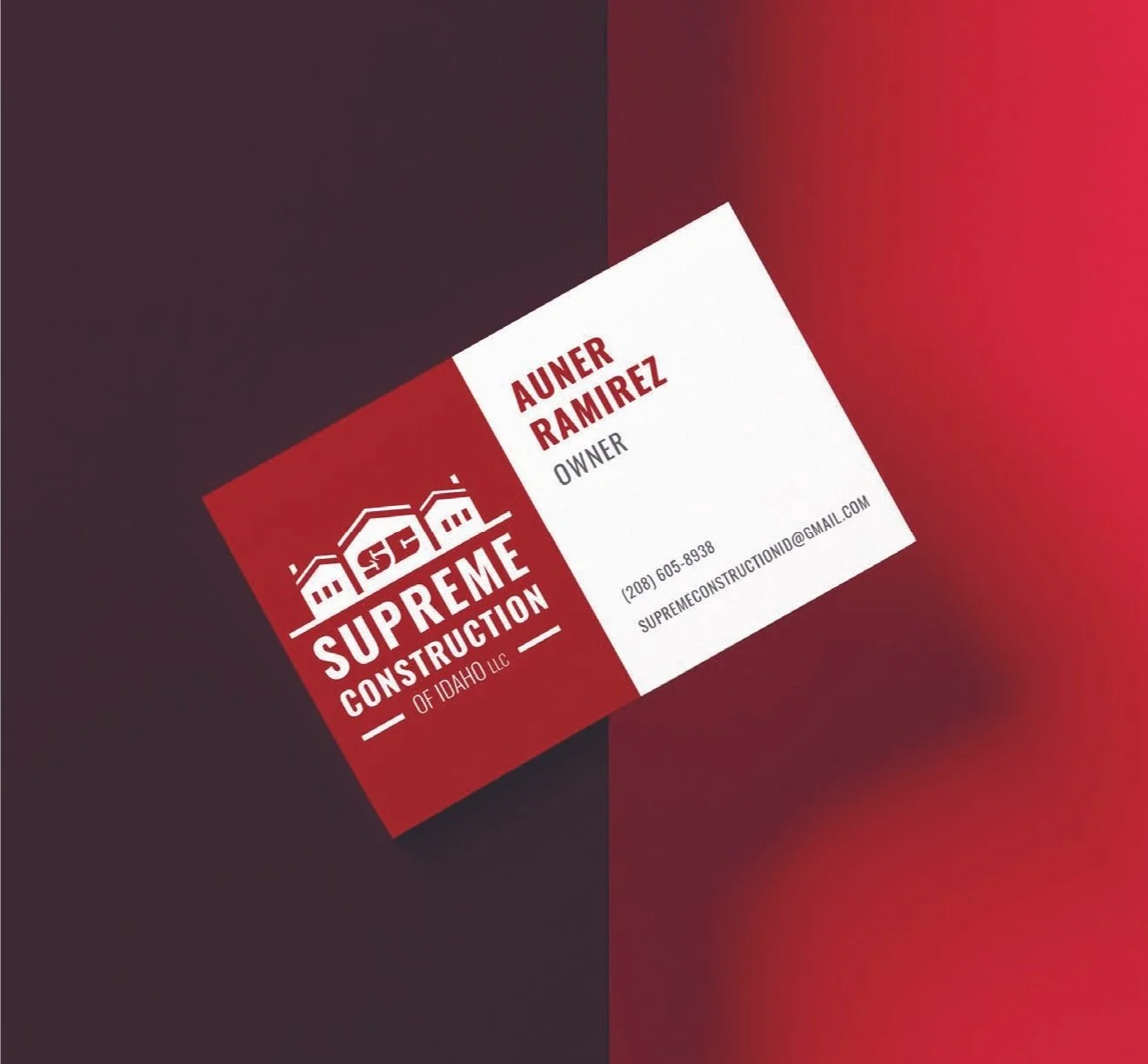
Business Card Design

Social Media Post

Trailer Mockup